Designing for support teams
It is not obvious how to design for ops and support teams:
- Most design advice is tailored for consumer apps
- If you look for product design inspiration in Dribble, none of them will be for ops.
- Designers and engineers bias towards beauty and attractiveness.
- Designers and engineers love the “clean look” that presents amazing but on second thought doesn’t let you do half of the things that you are used to doing with the app
- Designers and engineers are almost never support agents.
I worked on dashboards for ops and support twice:
- The internal admin dashboard for an e-commerce company, which 5 people use for 8 hours a day (including me for a year)
- The Stripe Dashboard, which many many people use daily.
- The Stripe Dashboard has many types of users but unsurprisingly, support agents spent the most time there.
When working on those, I had to reconsider a lot of design lessons:
The user is not the customer
There is one person choosing the software and somebody else using it everyday. Keep this in mind while you design. The natural incentives from this arrangement can take you to dark places if you let them. IMO, it is your job to win the customer and still make the user happy. This is doable, but only if you understand the misaligned incentives.
The first impression doesn’t matter
Your user is going to spend entire days in it. By the second week, they’ll have so much exposure to the app that they are not going to remember how they felt the first time they used it. Especially if the user is not the customer, don’t make any long-term usability trade-offs to make the initial experience “less overwhelming” or “more approachable”.
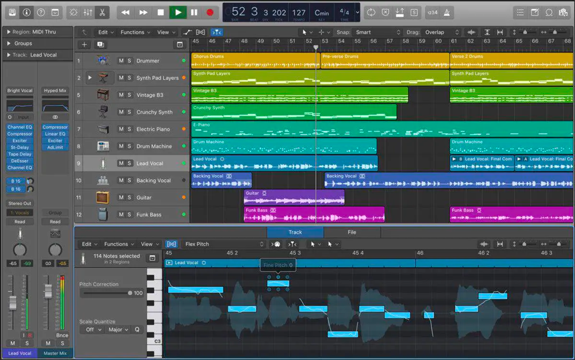
Expert software like Logic Pro knows their users will spend their lives in there. The first time can be daunting and that is fine.
Everything in one page please
Power users can scan pages the information they need really quickly, but that is only if:
- The same information is always in the same spot
- All the information they need is there
They can’t do that if they have to click or scroll to get to the information they need on every task. Always bias towards putting as much information in one page as possible, so that they can complete their task quickly (above the fold if possible).
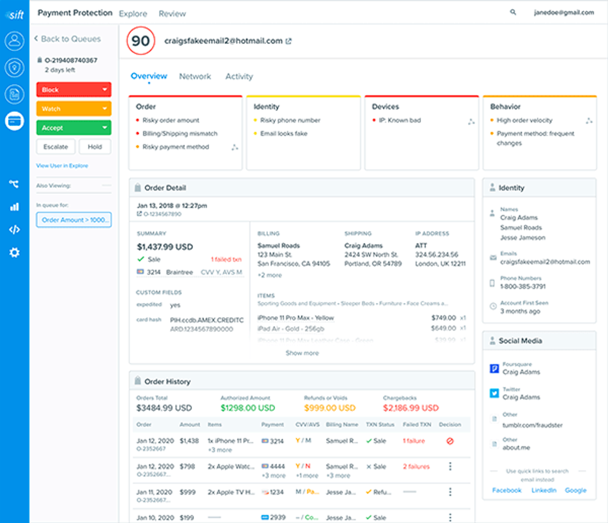 This dashboard from sift science has a lot of information in one page. (I have never used Sift, so I can’t endorse it, but the fraud review dashboard’s I’ve built ended up very similar)
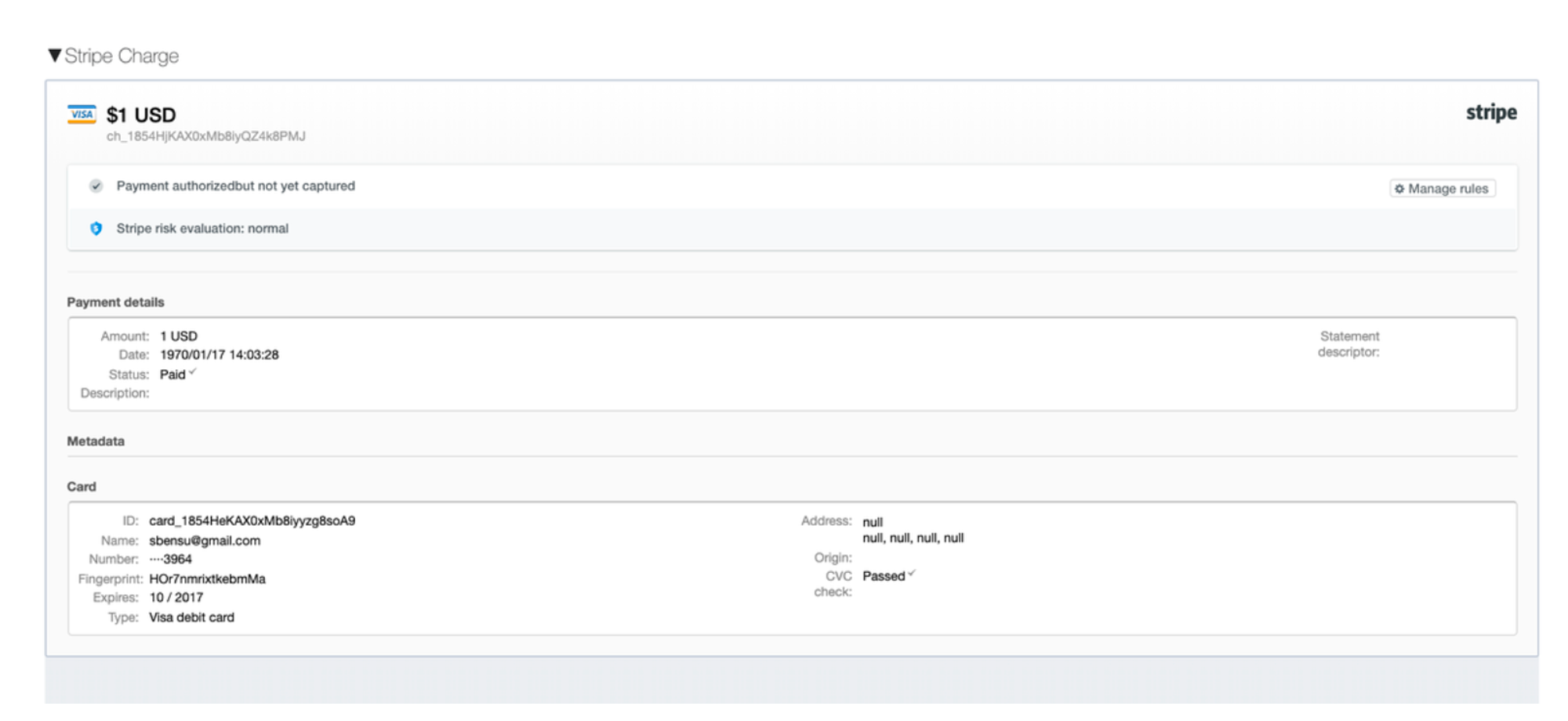 At some point, I inlined the Stripe dashboard inside of our internal admin dashboard so that the team wouldn’t have to go to Stripe to find the information.
The opposite of “everything in one page” is Turbotax. If you are not an accountant, you only use Turbotax once a year. You want the software to slowly explain to you what it is doing every time you use it because every time is like the first time.
Navigation speed eventually dominates
If you can’t put everything in one page, the user will have to navigate between pages. Eventually, their only request will be for the navigation between certain pages to be faster. Until you get to 200ms or so, they’ll always want you to prioritize navigation speed over cosmetic changes. This also applies to waiting for updates, suggesting that you should bias towards optimistic updates for most updates. Linear does this well with a flashing notification in the bottom right.

Linear doesn’t wait on the server to take your actions and then flashes a notification in the bottom right of the screen after each action is successfully completed.
Don’t change things too often
The eye-memory, the muscle memory, it gets built up over months. If you redesign the page often, power users will resent you (even if the change will be worth it over the long run). If you can, explain how the change helps them do their job faster before you deploy the change and give them some time to adjust to the time.
Teach and reinforce keyboard shortcuts
The power users will learn them but only if (a) they are there and (b) you remind them they exist. An easy way to do this is to put them next to every button.
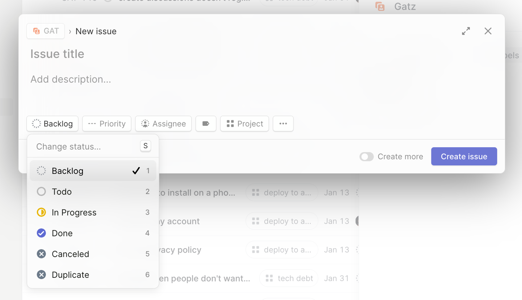 Linear shows the
 S on the status dropdown an 1 through 5 for the options. Great! It would be even better if they showed the S even when you hadn’t clicked on the button: what is the keyboard shortcut for “Create issue”?
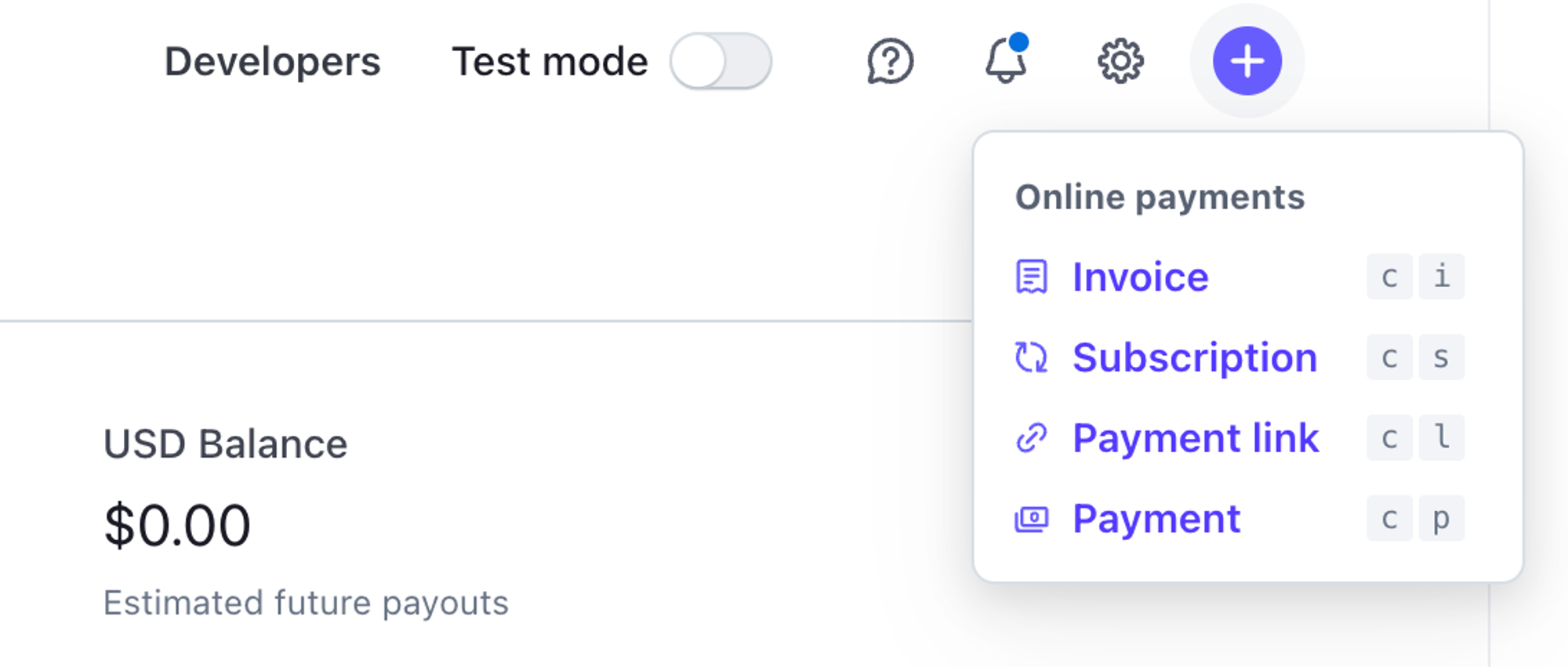
Stripe Dashboard has c p to create a payment.
Copy-paste, copy-paste, copy-paste
For tasks like ops and supports, copy-pasting ids, emails, or other data from your app is going to be half of their day. If you know this, add “click to copy” buttons wherever you think they might need them
 Many ids are copyable with one click, and they include the keyboard shortcut on hover
Consider server-side rendering
JavaScript feel more interactive and in many cases they are worth it. But for many forms, consider rendering HTML on the server:
- Time to first interaction is usually much faster
- The back button will work well
- People understand how basic HTML will work, what will be submitted, when.
- You can specify a lot of standard validations on the HTML itself.
Log everything that happens and display it
Users handling “tickets” will often have to piece together what happened. It is much easier to do that if they have a nice log of everything that happened related to the ticket. This is usually easy to build if you start with that idea from scratch:
- Every mutation to your database goes through an “event” or “log” first.
- The log is appended to an append-only table in your database with a name (e.g.
ticket.closed) and an index to the ticket. - You pull all the logs for the ticket when viewing it.
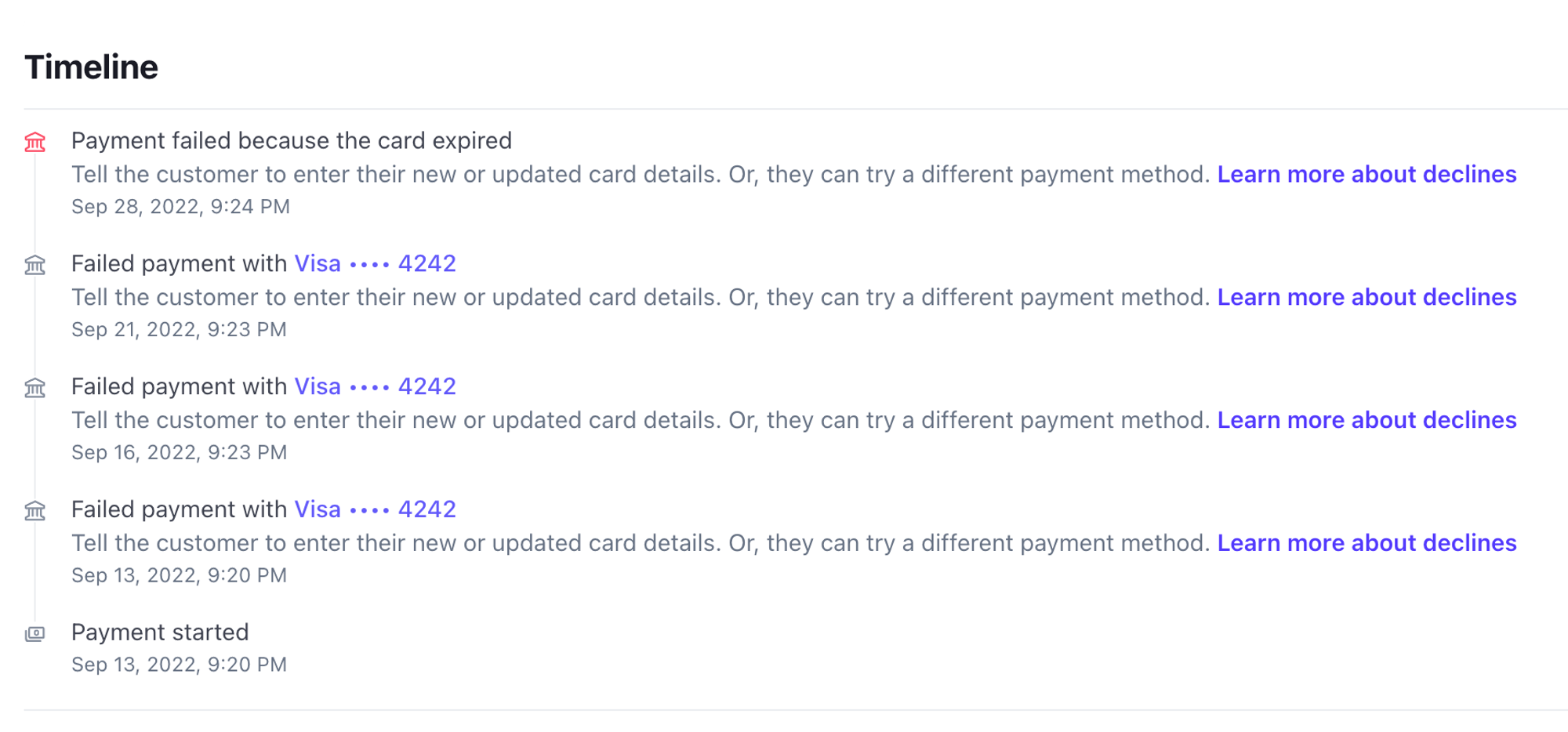
Log when people access things and display it
Users will often wonder “who else has worked on this?”, including supervisors. Attach the id of each users that has seen the ticket to it as a log, and include in every log the id of the person responsible for it (e.g. “by greg”).
Add ad-hoc notes to every object
Plenty will happen that is not captured by your schema. Tickets and cases will be special in ways that you can’t foresee or that it is not worth capturing. For all those cases, it helps tremendously if there is a quick way of the users to take notes on the side that they and others can look at later. You can always store it as another event in the log 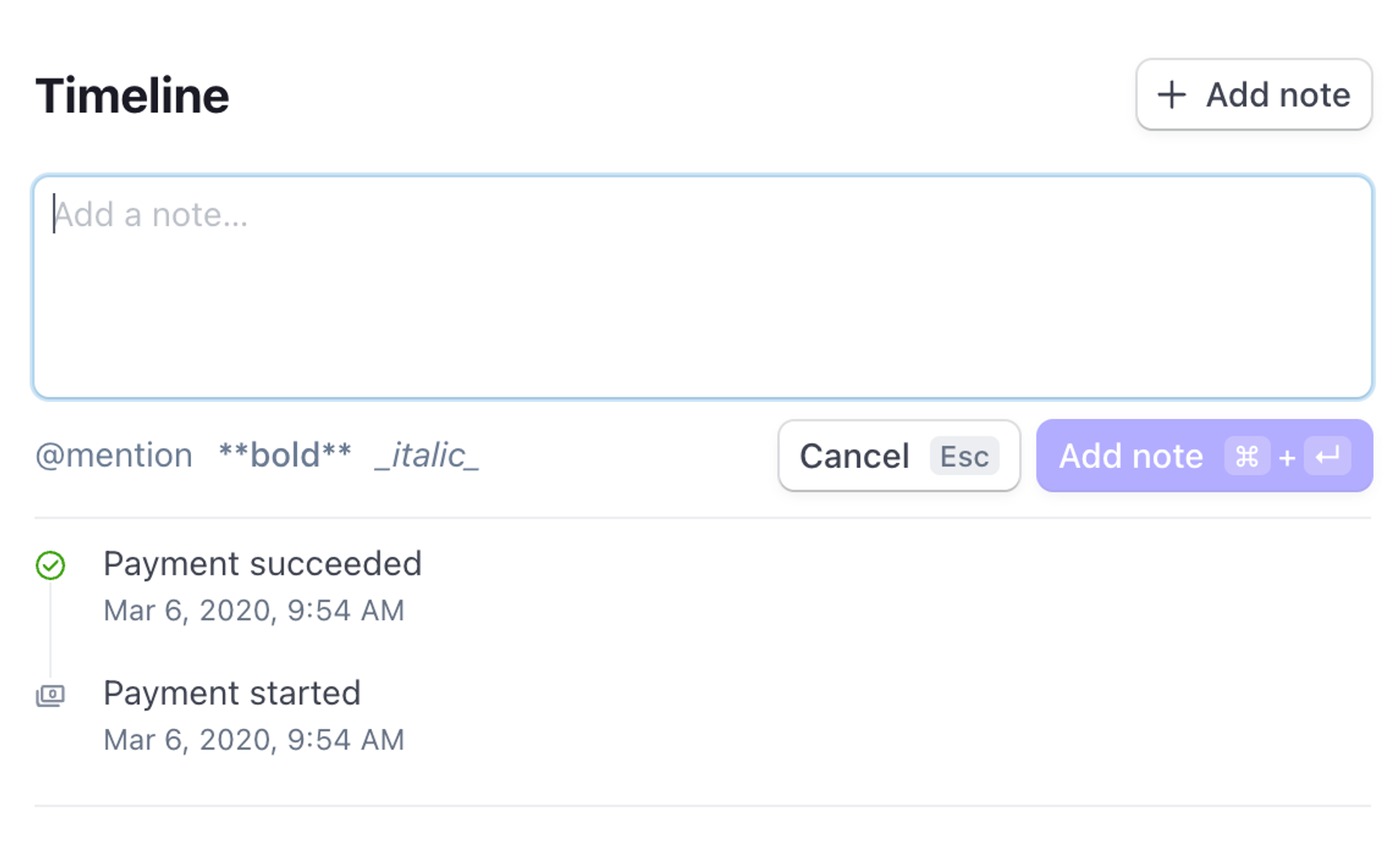
Links will be shared
If there are multiple agents that have to look at the same ticket or page, they’ll want to share with each other what is happening. Make sure that urls capture enough state for the receiver to reproduce what the sender wants them to see.
For example, the Customer page in the Stripe dashboard has two tabs, Overview and Event logs, but when you navigate between them, the url path is not updated. So later, when I send “have you seen this? https://dashboard.stripe.com/customers/cus_FLsAyOB2FK3V3P” to my coworker because one of the events under Events and logs looks off, they’ll reply with “no, what?” because the Overview tab looks fine.

This is especially important for list views with filters: as you click on Top customers, First-time customers, etc the url changes to reflect what you are looking at, including the sorting order:
https://dashboard.stripe.com/customers?sort_field=net_volume&sort_direction=desc&cols%5B0%5D=totalSpendhttps://dashboard.stripe.com/customers?sort_field=net_volume&sort_direction=desc&cols%5B0%5D=totalSpendhttps://dashboard.stripe.com/customers?sort_field=first_payment&sort_direction=desc&cols%5B0%5D=firstPayment

URLs are part of the UI
Users will learn how to make urls that take them to where they want to go. They’ll use them as shortcuts to get around navigation problems that you don’t know you had (i.e. getting to /settings/special quickly). Try to make the urls intuitive.
Export to CSV is often the best UI
Some Most things are better done in a spreadsheet. Are you going to calculate a bunch of ad-hoc totals and pivot tables for the user? Do they want that? Or do they prefer a CSV that they can import into Excel? Whenever somebody asks you for a SUM(A1:A24) in your app, asking what else they’d like to calculate. If they have 10 follow ups, half of them ad-hoc to the case they are handling, give them a CSV export. They’ll eventually thank you for it.